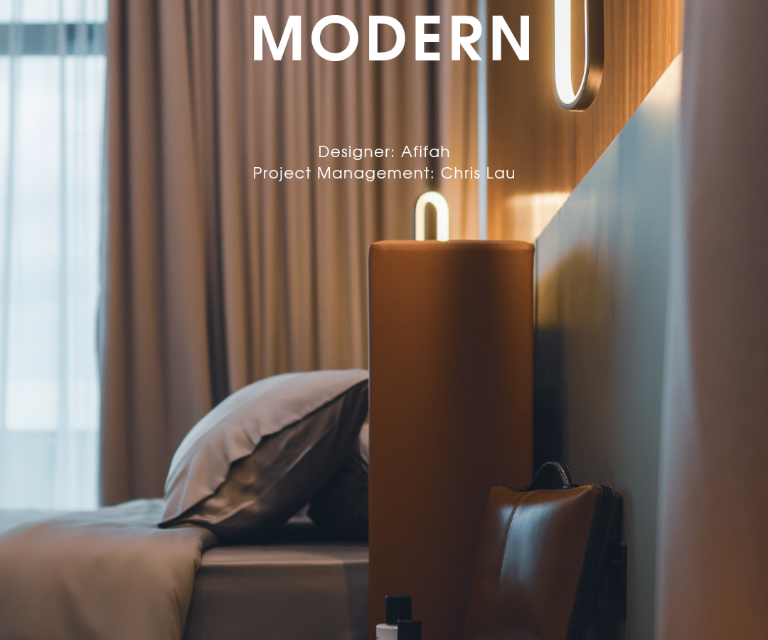
On January 2022, Carrick came to Red Land Group atelier to express his concern on his new house design, still bare unit at that time under design service from other interior design firm in Ipoh which leads to his dissatisfaction when comes to design, professionalism and timeline.
As our firm taking over to develop the project, Afifah, our in-house designer who is a perfectionist herself striking the right balance of modernism without compromising ageless result which is the key to create an ambience that would stay fresh for years to come.
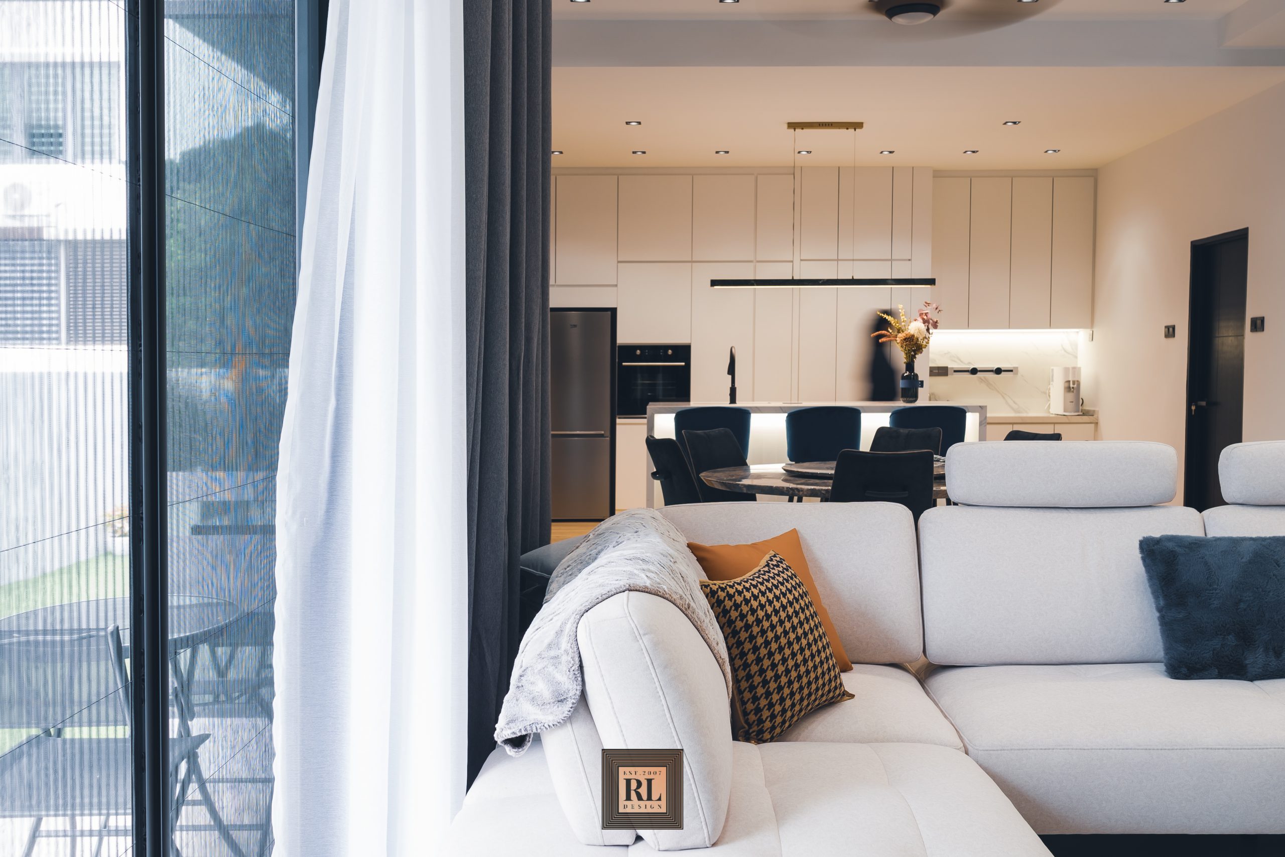
Each element is essential on blending the interior design concept colors to be contrasted without overdoing
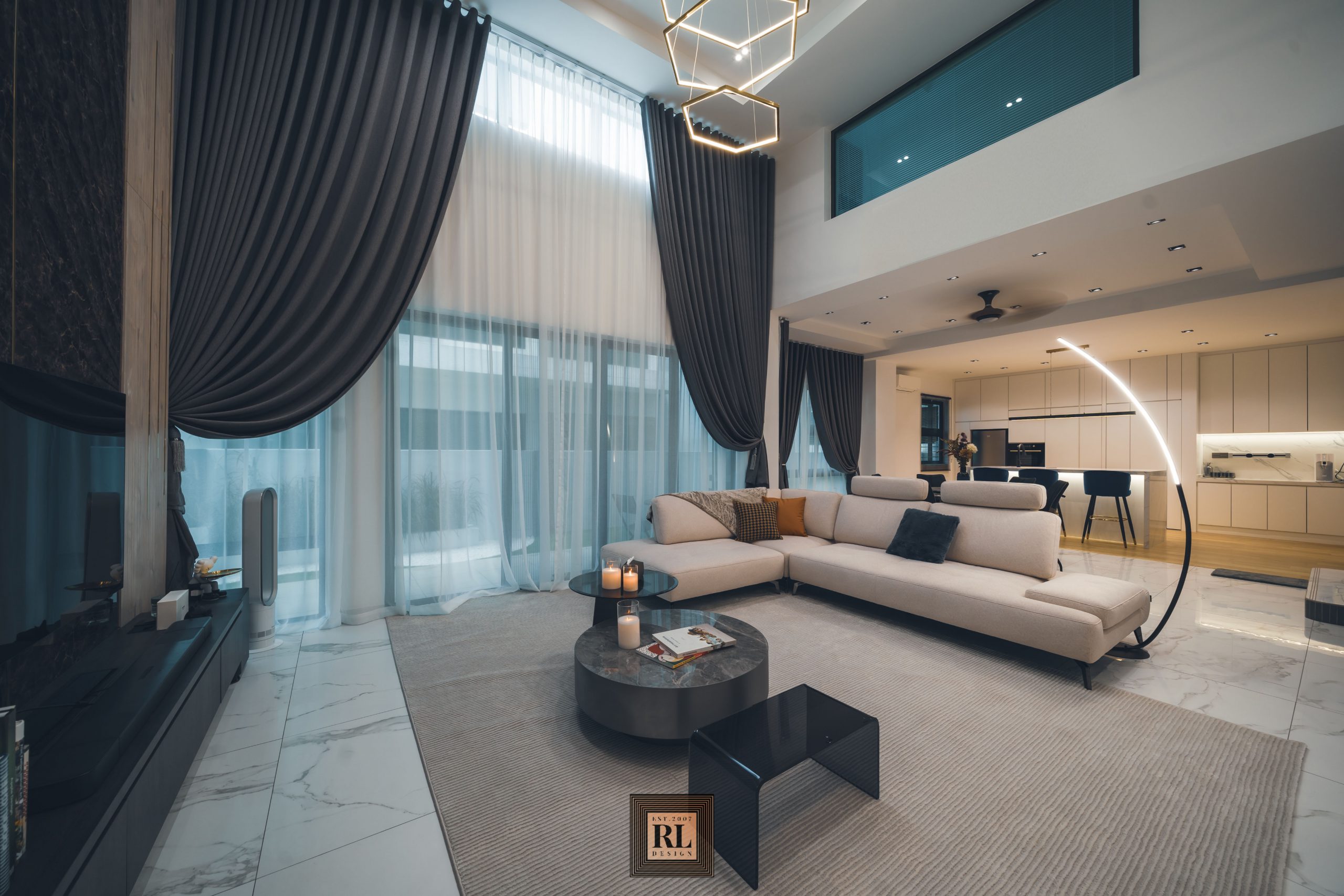
For a modern house as this, bright and clean design incorporated through open area from living to dining and dry kitchen creates atmosphere of sophistication and inspiration.
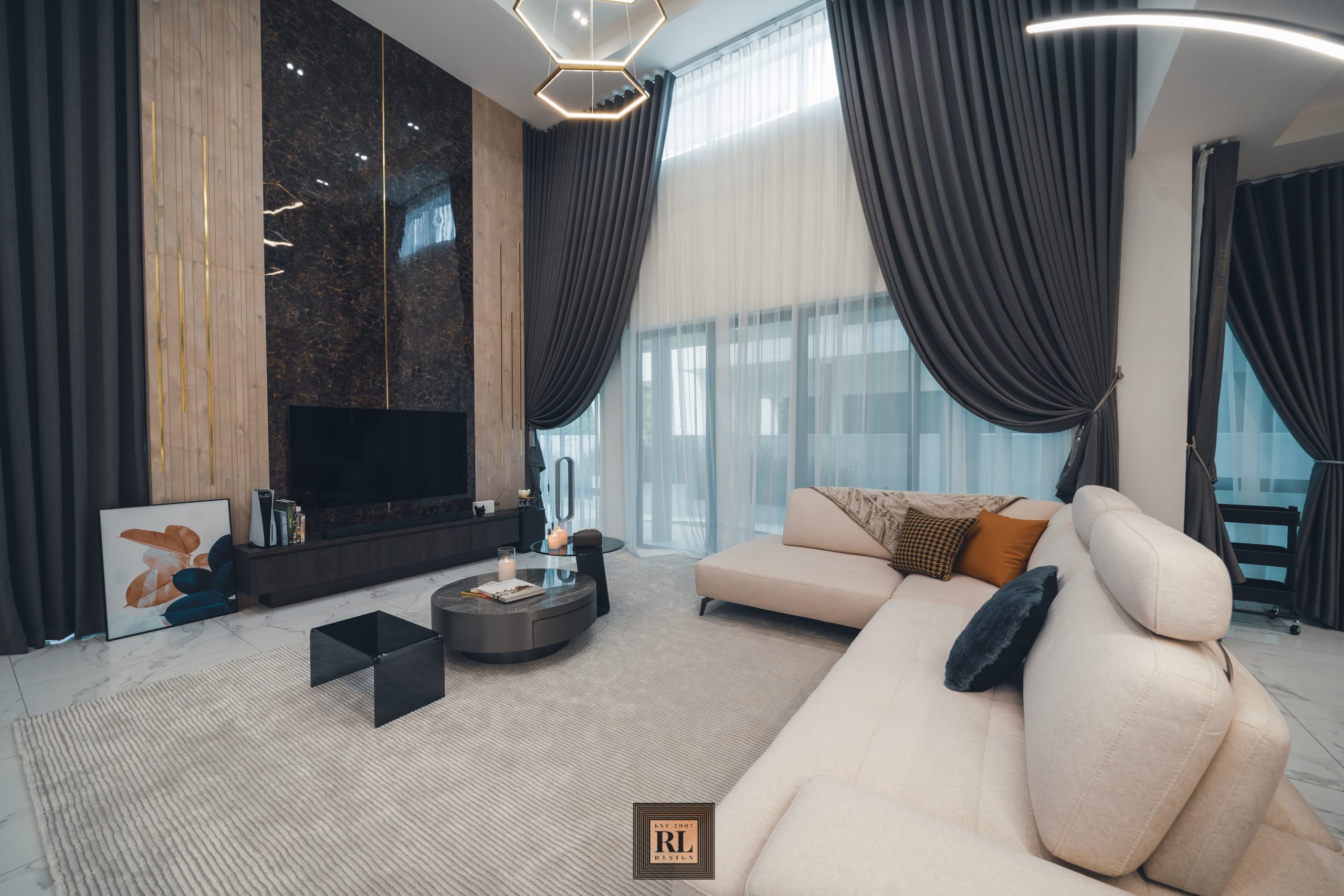
As the ceiling height up to 18 feet height, TV panel and curtain was made up to maximum height to bring up the elegance at living area. Panel was made of marble, wood with laminate and gold chrome steel, such detail enhancing the classiness of the home.
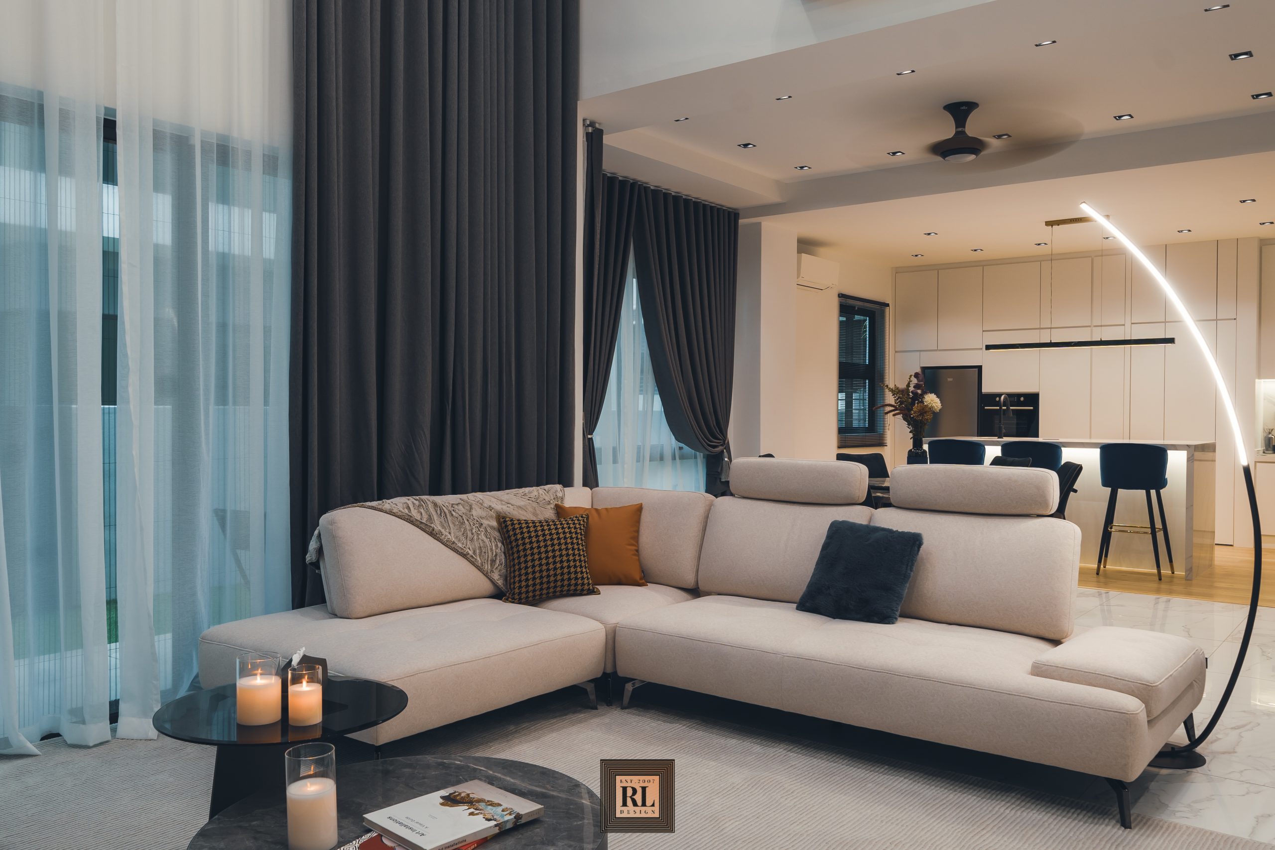
Chosen coffee table resemble the TV panel marble color tone, the only darker tone aspect to be contrary with other fundamental which mainly in bright.
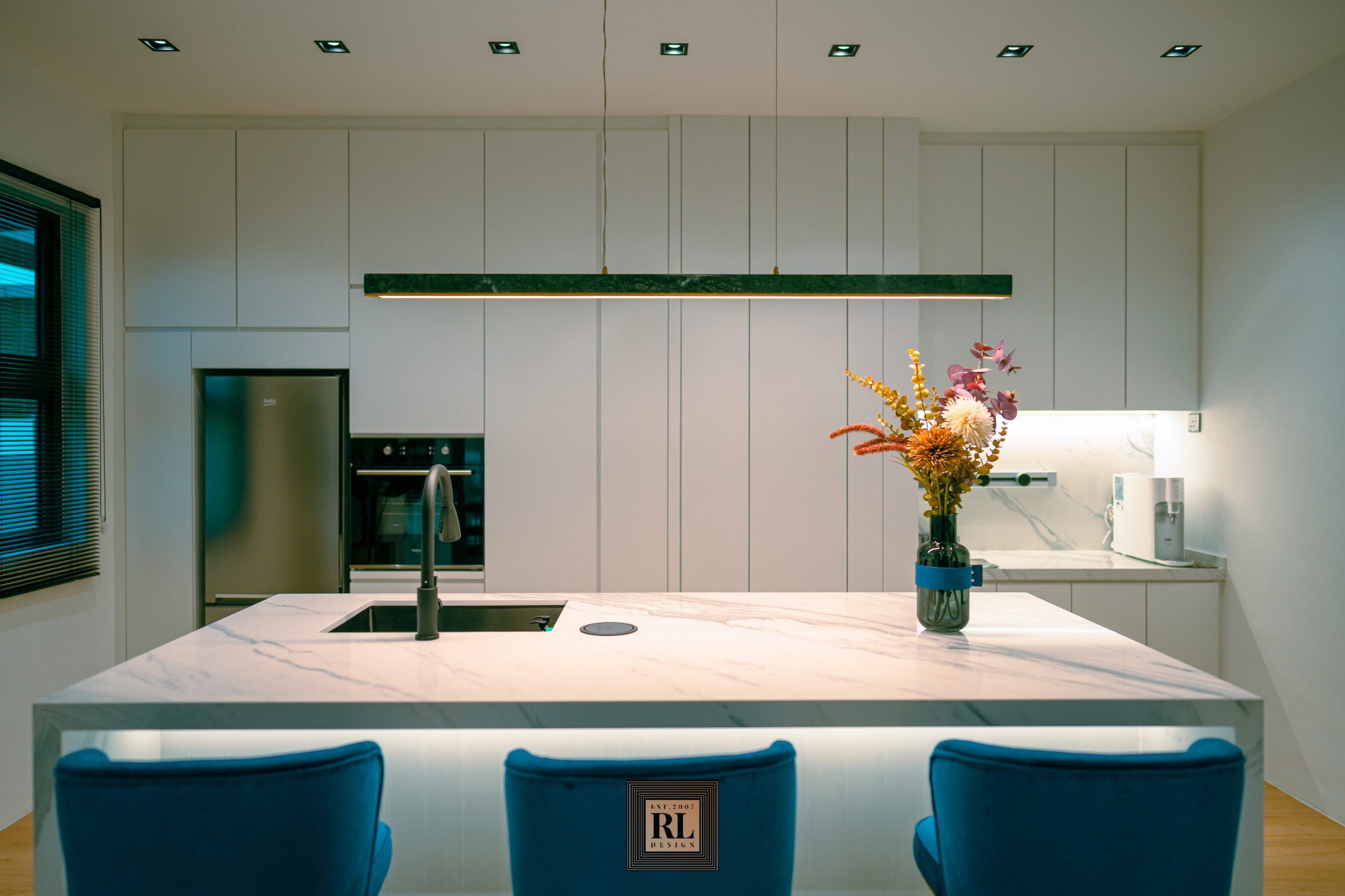
In addition of large couch, a hangout space here at dry kitchen was built as a place for immediate friends or family to spend time together with drinks and snacks all stored inside fridge and full height cabinet, a long term declutter solution.
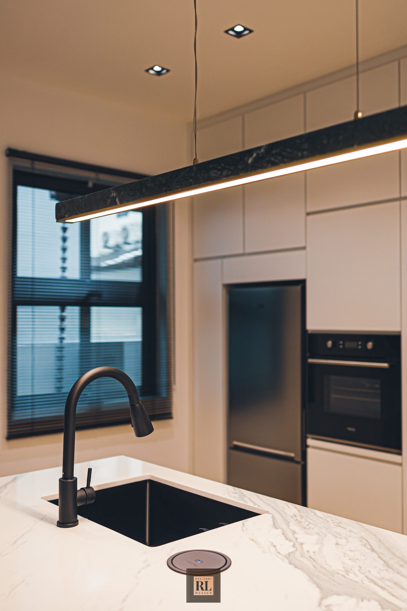
Table top made of quartz stone integrated single bowl basin and wireless charging device with built in hidden power point.
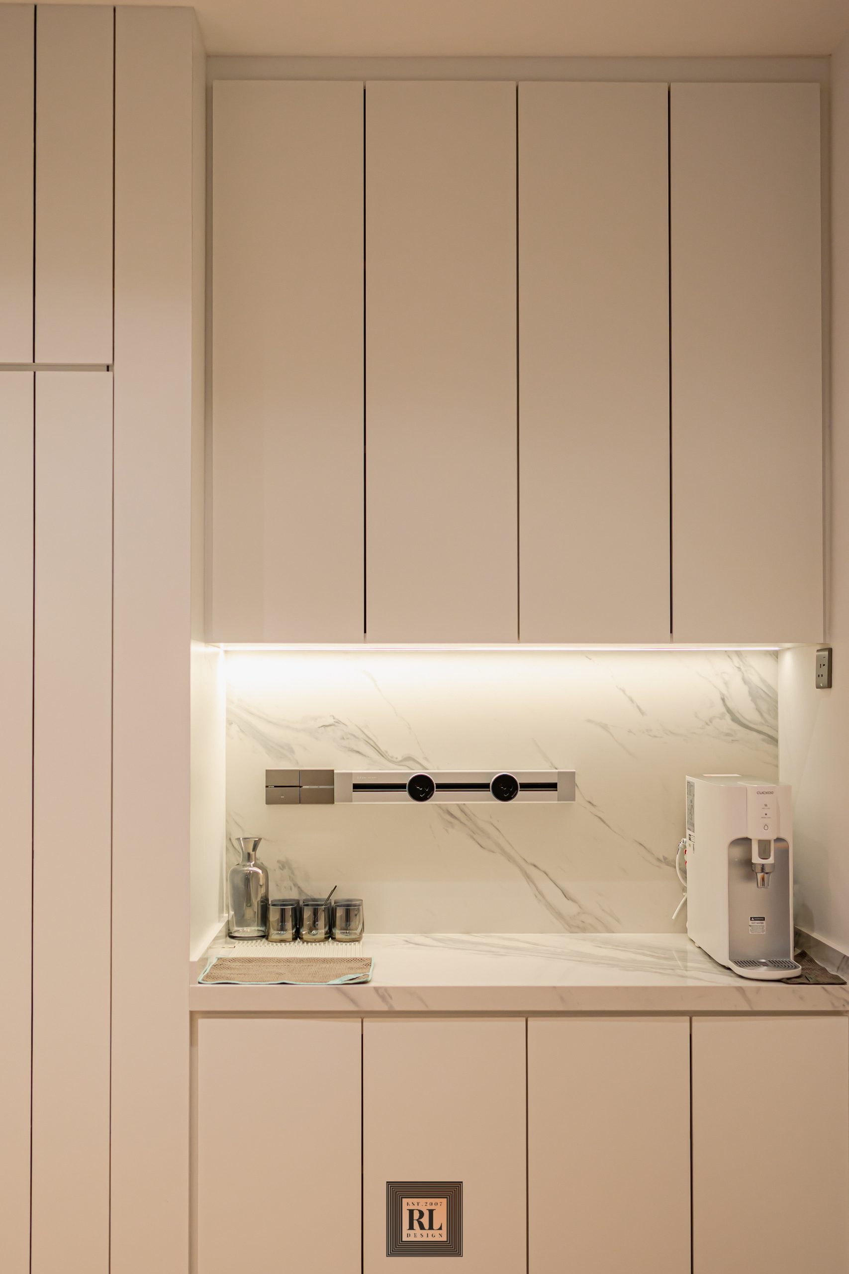
While main essence throughout the interior was designed in clean bright features as the fundamental theme, the palette in the formal spaces leans toward quiet and serene. We take the same table top marble texture quartz as backsplash of dry kitchen which lends nice texture.
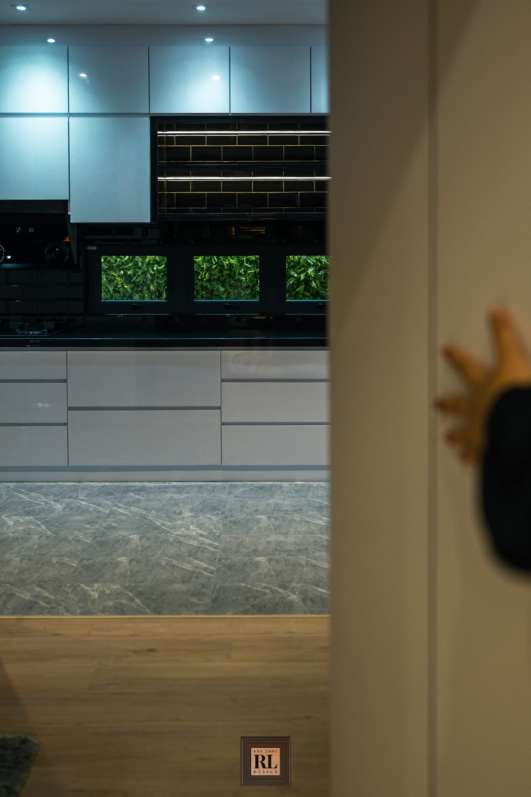
Behind the tall cabinet in dry kitchen was wet kitchen extended from existing structure leads from a hidden access from one of the dry kitchen panel. This is a common feature to hide an access with well selected mechanism.
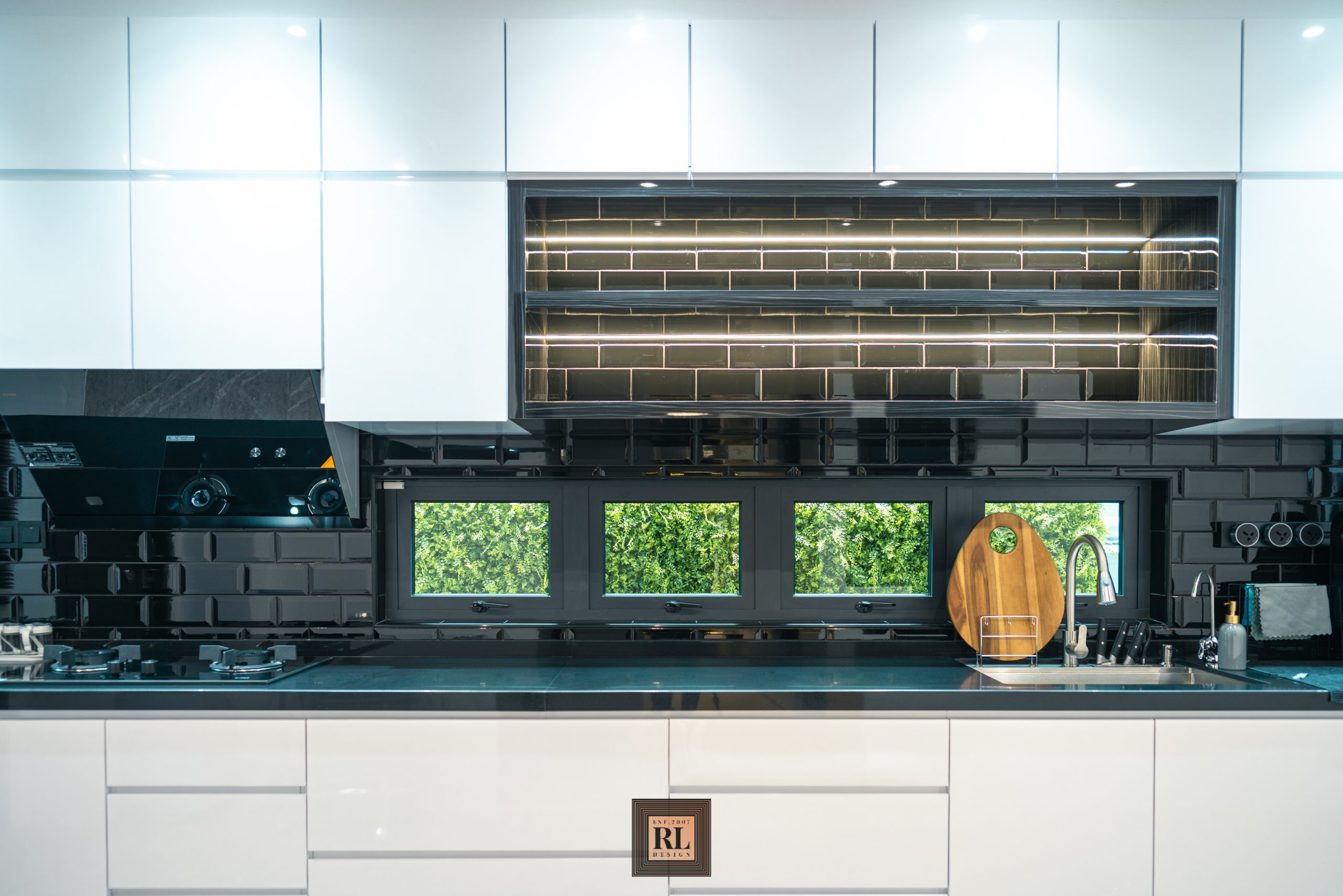
The wet kitchen is a newly construct, extended from rear section. The greenery plants behind can be seen through small windows here was attached on a share wall with neighbor behind. As originally it was bare and too close to the kitchen, this is where we propose a vertical garden which continuously installed until the side of this semi-D to provide a serene feel in it.
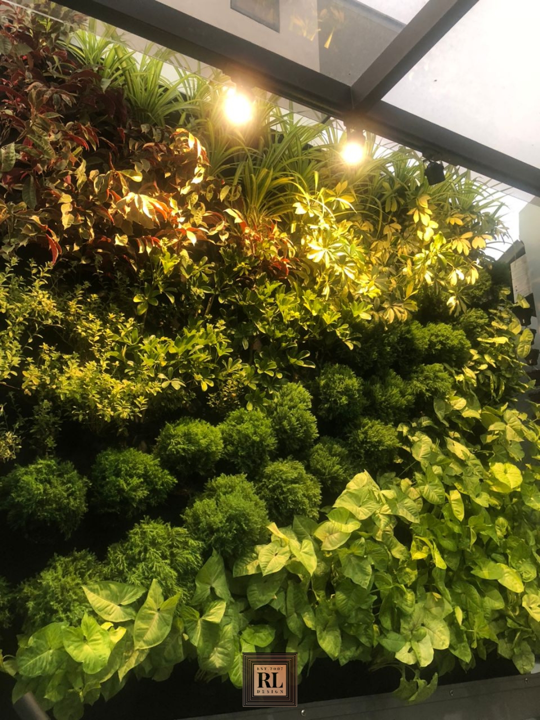
Vertical garden section is essential part of wow factor of the house, with our co-partner Nature Garden come up different plant species arranged in an artistic form, it is a first-rate result when comes to landscape design.
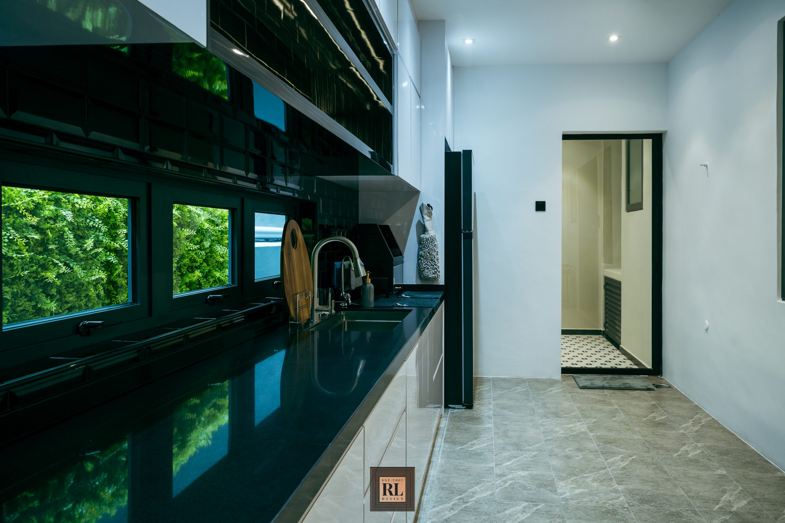
We apply marble tiles flooring with black and white for the backsplash, table top, walls and cabinets as a more neutral modernism palette. As walk forward to the laundry area, we apply a little dramatic mosaic tiles to distinct between two sections.
Watch the progress of the extension work and project progress from start to end at instagram.com/gununglangsemi_d
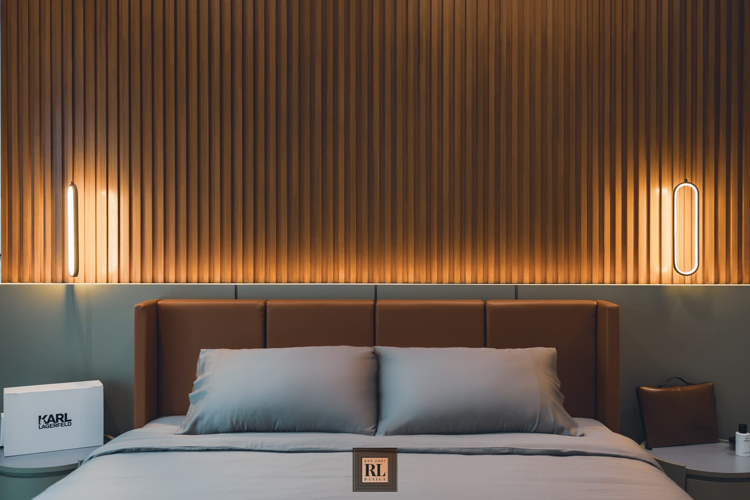
This residential project overall more towards to lighter and clean trend, for master bedroom tend to be darker, deeper and richer while keeping the relaxing ambience as we good at.
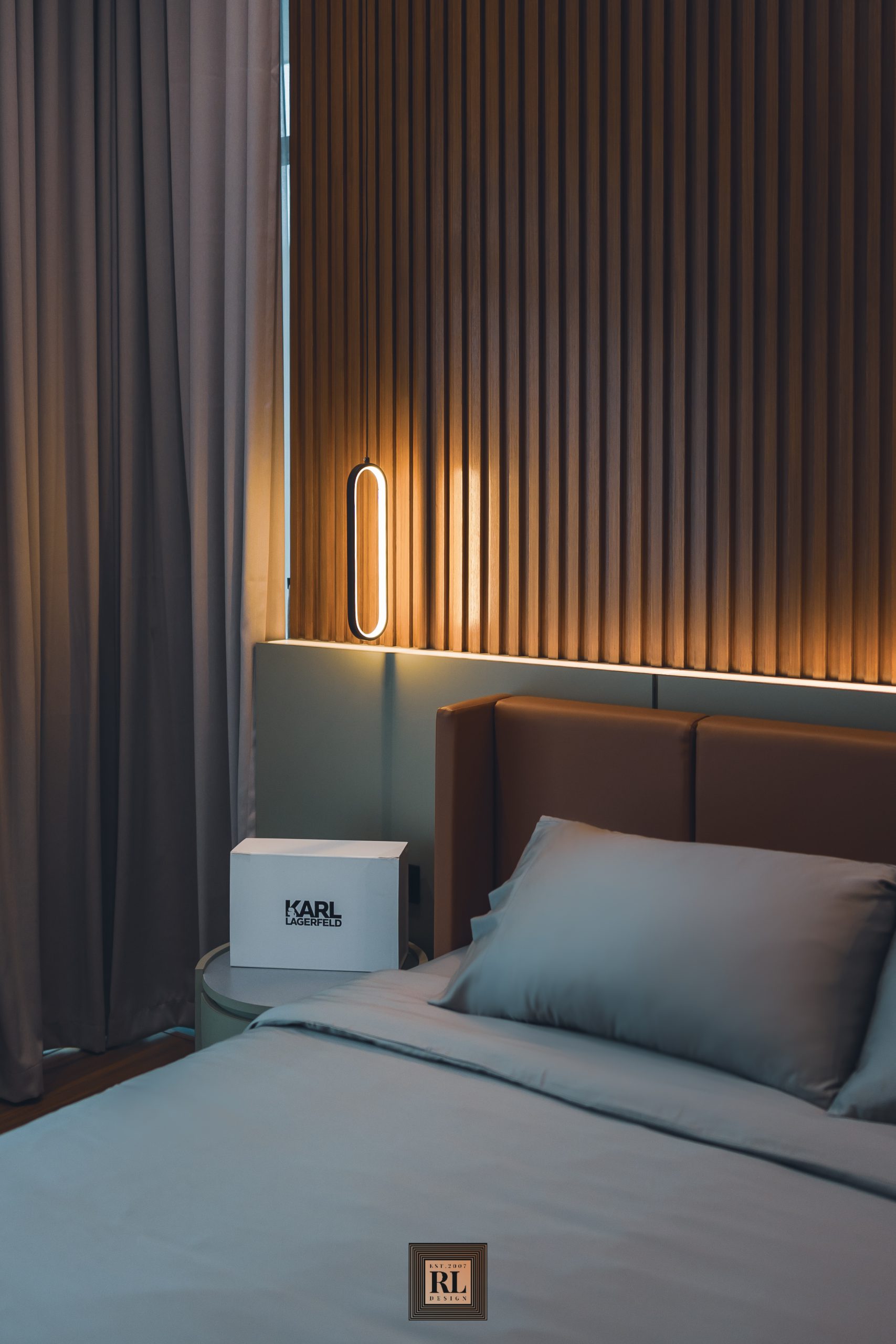
It may a small detail, but the green bed panel color choice was on little retro side, a daring experiment which does not affect the modernism theme, it just looks great by contrast.
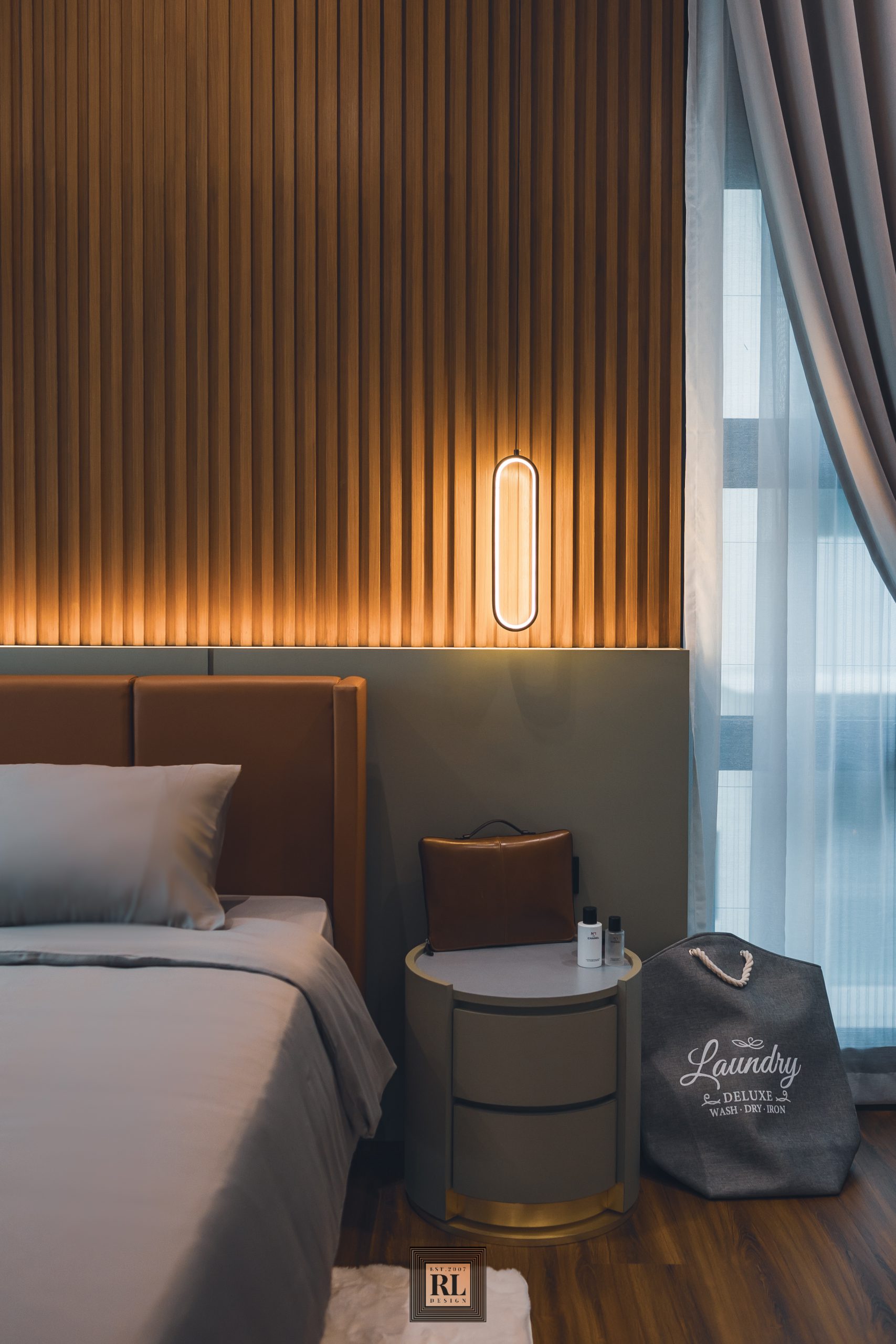
Every fitting here as well as the bed frame and bed side table (note on the golden base) was customization work; designed and hand built . Red Land Group label tend to make every project in the most personalize result.
